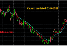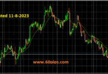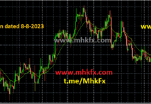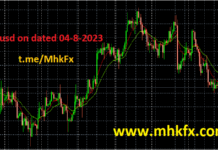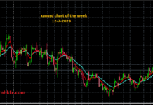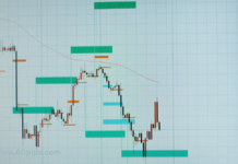
Creating an analytic chart for forex (foreign exchange) involves visualizing the price movements of currency pairs over a specific period of time. One of the most commonly used types of charts in forex analysis is the candlestick chart. Here’s how you can create and interpret a candlestick chart:
Step 1: Data Gathering Collect the historical price data for the currency pair you’re interested in analyzing. You typically need the following data points for each time period (e.g., each hour, day, week):
Opening price
Closing price
Highest price (high)
Lowest price (low)
Step 2: Choose a Timeframe Decide on the timeframe you want to analyze, such as 1 hour, 4 hours, 1 day, etc. The choice of timeframe can affect the level of detail in your analysis.
Step 3: Creating the Candlestick Chart Now, let’s create a candlestick chart based on the gathered data. Here’s how each candlestick is constructed:
- Draw a vertical line from the lowest price (low) to the highest price (high). This line forms the “wick” of the candlestick.
- Draw a rectangular shape from the opening price to the closing price. This rectangle is known as the “body” of the candlestick.
The color of the body can vary based on whether the closing price is higher or lower than the opening price:
- If the closing price is higher than the opening price, the body is usually filled with a bullish color (e.g., green) to indicate a price increase.
- If the closing price is lower than the opening price, the body is usually filled with a bearish color (e.g., red) to indicate a price decrease.
Step 4: Chart Interpretation Candlestick charts allow you to quickly understand the price action and market sentiment. Here are a few key concepts to understand:
Bullish Candle: A candlestick with a higher closing price than opening price. It suggests potential price increase.
Bearish Candle: A candlestick with a higher opening price than closing price. It suggests potential price decrease.
Long Wick: A long vertical line indicates high volatility during that period. It might suggest a potential reversal or significant price movement.
Doji Candle: When the opening and closing prices are nearly the same, it forms a doji candle. It indicates market indecision and potential trend reversal.
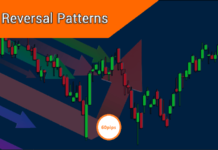
Patterns: Patterns formed by consecutive candlesticks can give insights into trend continuation or reversal, such as engulfing patterns, hammer, shooting star, etc.
Remember that forex analysis involves more than just looking at individual candlesticks. Traders often use multiple candlesticks, technical indicators, and other forms of analysis to make informed decisions.
If you have specific data you’d like to visualize or analyze further, feel free to share, and I can assist you in interpreting it using candlestick charts or other appropriate charts.
Related Articles:
What is Technical Analysis?

